|
Ghost
in the Shell 2:
Man-Machine Interface figure
|
Type: Plastic figure
By: Yamato Toys/Toycom/Alpha
Price: Sing$19.90
Out Now.
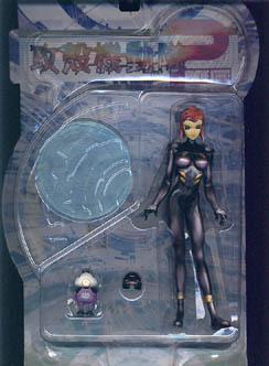
The new GitS figure is finally out, based on the sequel manga to the original Ghost in the Shell by Masamune Shirow.
 |
 |
As expected from Shirow, the new versions are once again super sexy depictions of the Motoko character. There are 3 figures in this series, and there are 3 randomly packed little mascot characters and one chase version which is short-packed. it's easy to spot which: it's red and black (not purple) and it's got a vizor on. I saw 3 yesterday, so it's not that rare, but all of them were packed with the figure in a dress...probably a sales gimmick since that one looks to be the least popular (and the most fully-clad. Coincidence?)
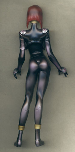
This set comes with one figure, one mascot (I got the angry eyes version), and a faceplate/visormask). There's a small protrusion on each side of the vizor that goes inbetween the figures cheeks and bangs, holding it securely in place. There's also a stand included. The design of the stand is interesting, with intricate techno-work all over, and it's an essential accessory. The figure will not stand on it's own, and even with the stand it suffers from a slight leaning problem. I wouldn't be surprised if in a few weeks Motoko will be trying to do a forward limbo rock dance as her limbs start to warp.
The figure itself sports a very sexy sculpt. Unfortunately all 3 figures are in the same pose! Kinda makes for a boring looking set. Nevertheless, this particular piece is looking good. The figure has 5 points of articulation: swivels at the shoulders, neck and calves...I broke one of the latter as I mistakenly thought the leg was one full piece...I was trying to bend the leg back for more balance. A reverse-warp, if you will. Never mind, easily repaired, so no loss. As is the custom with most Japanese female figures, the figure has no hip joints so as to allow full glorification of the ISA (That's Incredibly Sexy Ass).
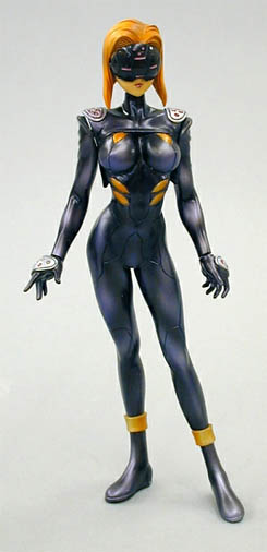
| The
paintjob is quite a piece of work as well. The metallic highlights bring
out the contours well, and for the most part it looks just like the
prototype pictures (see right).
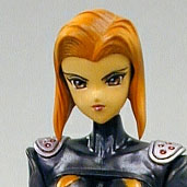
There are minor differences. The prototype has a more blue-ish tinge to the highlights. The actual item's tinge is a purplish silver. It changes the look for the figure rather drastically, but it's still aesthetically pleasing to the eye. The yellow highlights on her torso have been toned down to a rusty gold as well. The change I disagree with the most is that of her hair colour. The yellow tone of the prototype looks much better and matches the rest of her overall colour-scheme. They instead gave the actual figure a sienna red hue, and of all things added SILVER highlights to the front of her hair. It's a really bad move; it looks terrible, and I'll probably repaint it sometime in the future to correct it! |
|
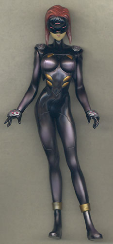
What I am REALLY disappointed with is her head sculpt. Here's a pic of the prototype:
 |
And Here's the actual figure:
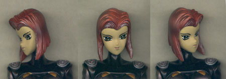 |
Granted, it's close, but there's something just odd about it. From the side, it look too flat, almost like she slammed straight into a brick wall. The paint job on her eyes has been altered slightly, for the worse. The eyes now look too wide for her face, for the edges reach to the side of her frontal profile. I'll be displaying this one with her visor on!
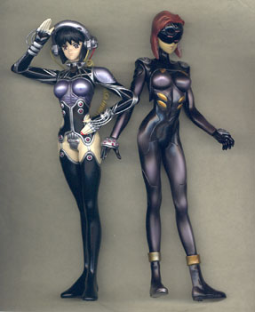
For those who are interested, this is how the new series stands up in terms of scale to the previous GitS figures. Needless to say, they're slightly bigger and aren't really that compatible. :-(
 |
~03/12/01~